Lockeroom website is a complete transformation. A bold, modern, and interactive experience that finally aligns with the brand’s vision and audience.
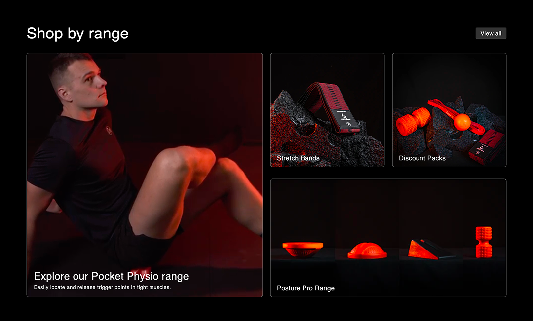
We started with a full-day workshop, getting deep into what Lockeroom stood for and how they wanted to be perceived. From there, we worked closely with Cameron and Michelle through ongoing calls and messaging to refine the strategy. We developed a new visual identity with a suite of graphic elements and a refined typographic system. We partnered with HeyDays for strategy and copywriting, ensuring their voice felt clear, confident, and authoritative. We collaborated with InText Films for a complete product photography shoot, where Vim Studio art-directed the visuals to ensure every image felt strong and on-brand.
Our solution
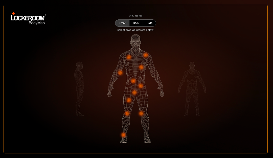
- By implementing a unified design system, enhancing product pages, optimizing the user journey, and integrating key features like Lockeroom's BodyMap, lockeroom online store is now more user-friendly, visually appealing, and efficient. These improvements have not only enhanced the customer experience but also contributed to greater brand loyalty and increased sales.
Challenge overview
- Lockeroom wanted a website that truly reflected who they are. Their old site didn’t align with their values, communication style, or the legacy they had built. Their voice wasn’t shining through. The previous site had unclear messaging, outdated design, and branding that felt bland. The imagery wasn’t compelling, and the overall experience didn’t match the passion and expertise behind Lockeroom.
Contribution
- New Theme Build
- Supported the launch
- E-commerce Development
Client
- Lockeroom
- Development ©July 2024